Trend: pastel gradient colours

Trend: pastel gradient colours
How can you create a dramatic gradient effect in your desserts?
Joseph Addison once said, “Colors speak all languages”. Different colours can have an impact on your mood and emotions, as it is something that we can relate to. For example, yellow brings connections to happiness, blue gives off a calming effect and red is associated to impulsive decisions – which is why a lot of fast food companies use red in their advertising!
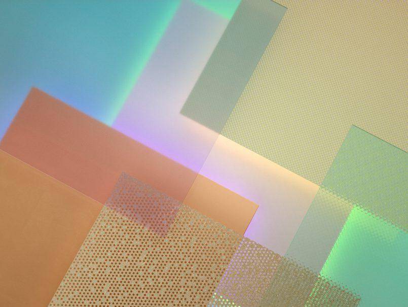
The gradient effect explores a hue of different colours in a gradual motion.
Pastel gradient is the new hot colour trend. Instagram has even redesigned their logo to create a new visual identity.
The icon has been graphically redesigned into a more abstract image with a gradient background. The gradient effect has moved into interior decoration, spilled over into contemporary packaging and now is becoming exposed to the world of desserts and chocolate.
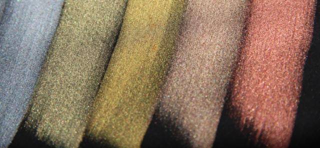
Chefs can easily create this colour decoration by using Power Flowers™ or creative metallic powders. To see how we produced this effect on pound cakes, look at the step-by-step tutorial listed below. It is even possible to add gradient colours to confectionary products, check out the extraordinary ‘volcano’ praline by Martin Diez and watch the video on how it is made.
So, why not get creative with colors and design the next chocolate sensation?


